Vispring
Bespoke experience design for pioneering British bedmakers
Engagement Details
The Challenge
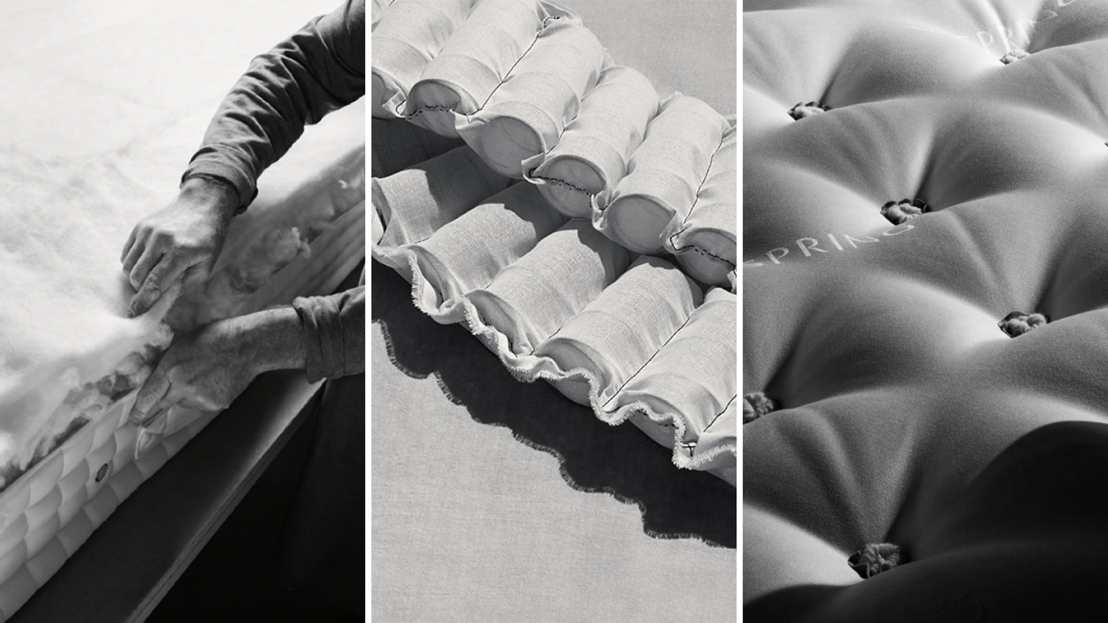
On average, we spend one-third of our lives sleeping. Yet up until recently, the average person didn’t value sleep as a key metric of health. Before it became popular to track our circadian rhythms or sleeping patterns, Vispring were designing sleep experiences that meant their customers could live fuller, richer lives with the mental and physical fogginess that comes with fatigue. Founded in 1901, Vispring is one of the world’s most luxurious and prestigious heritage bed and mattress makers. Pioneers in design, founder James Marshall is credited with the invention of the pocket-spring mattress; the gold standard for bedmakers today. Safe to say Vispring has a strong sense of heritage and craftsmanship but it wasn’t an entirely visible one. Engaged in 2019, bringing that sense to the forefront of a revitalised online presence was our team's first port of call.
The Approach
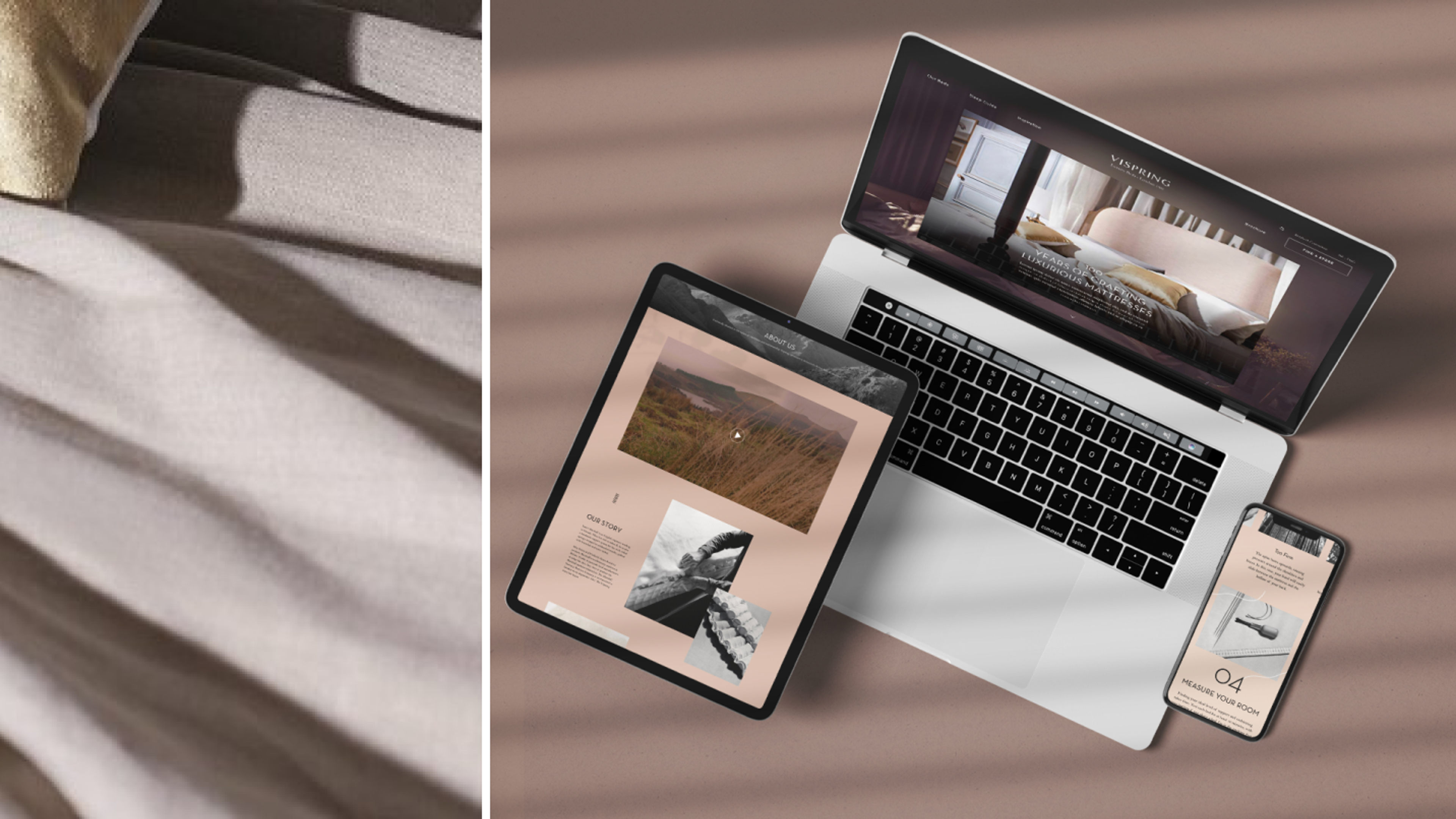
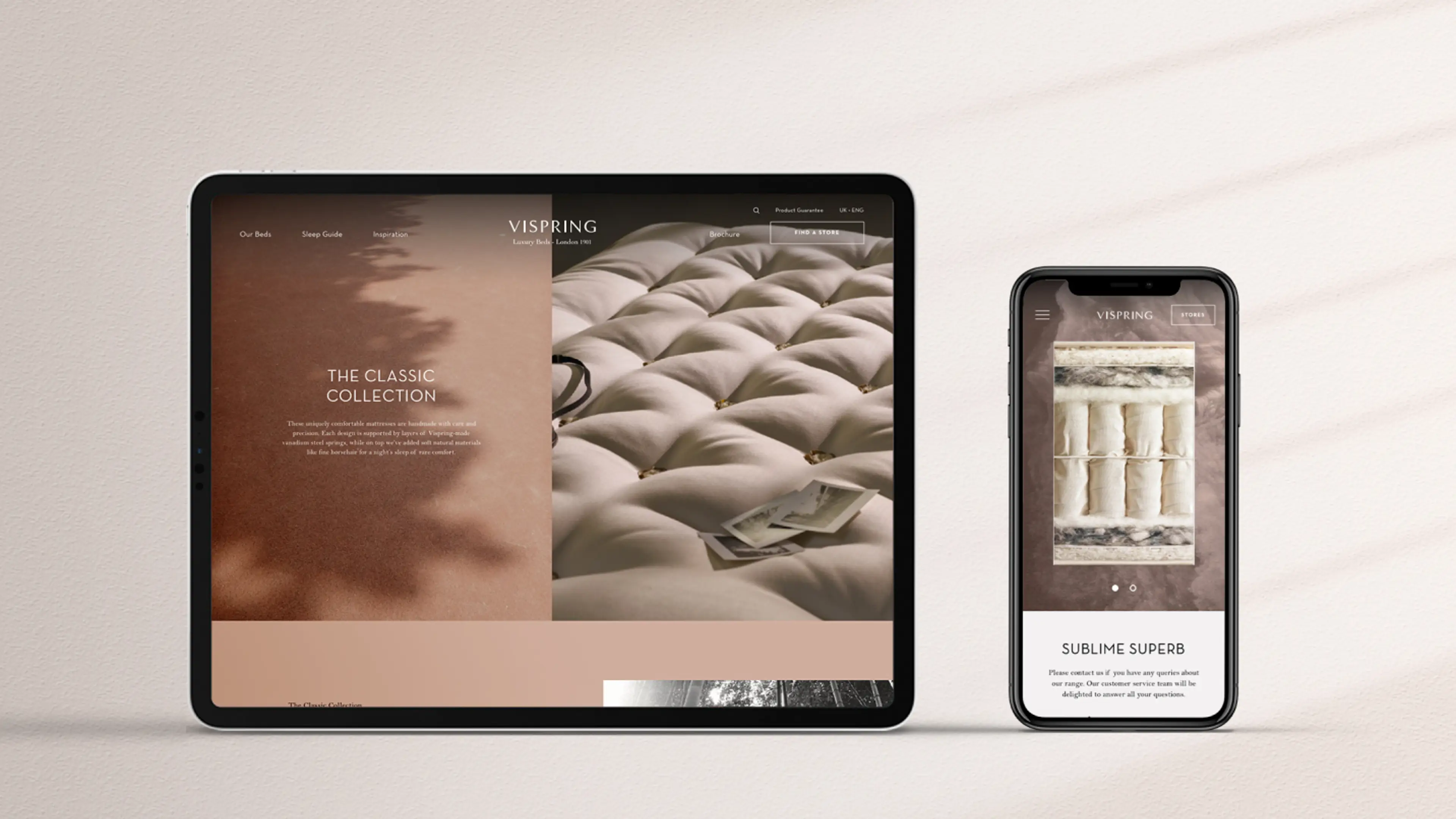
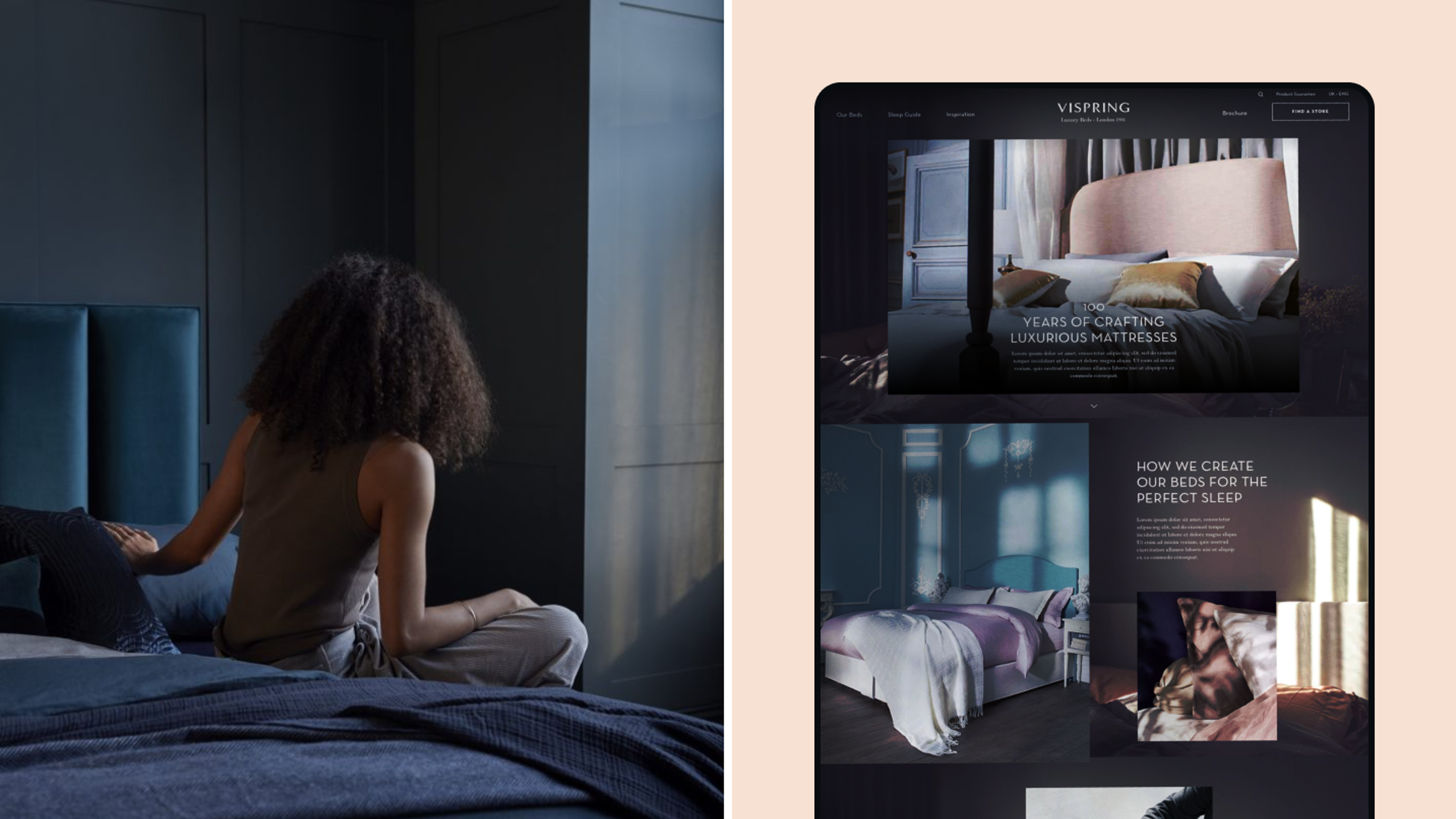
Insights informed every aspect of both our strategic and aesthetic restructurings. To highlight heritage and appeal to premium audiences, storytelling was an essential channel yet to be effectively utilised. To bring content into the product offering we designed multiple editorial pages, able to be filtered by lifestyle, design, product, sleep and wellness. Other key objectives included an organisational overhaul of their product portfolio, complete UX optimisation and driving footfall into Vispring stores. To meet the latter, our UX and technical development teams collaborated on a digital store locator featuring over 500 retailers across 15 countries; their new editorially-led brochure website complete with clear product taxonomy met organisational needs and a fully-developed educational configurator elevated Vispring’s bespoke offering, not only allowing users to select mattresses and beds based on individual needs but again bringing that craft element to the fore.
The Outcome
Our approach to UX specifically allowed for the execution of exceptionally crafted touchpoints throughout the online Vispring journey, ensuring effortless navigation for every user. A new design concept and art direction were introduced to help sharpen Vispring’s brand identity, showcasing the portfolio through a lifestyle lens and setting the tone for the brand going forward. Having demystified the product range through categorisation and clear price and elevation points, Vispring saw a 30% bounce rate decrease, a 40% uplift in time spent on each page, an 89% increase in store locator entries – indicating users are following through towards conversion – and a 96% increase in-store enquiries.


“Working with the team at Matter Of Form has been an absolute pleasure. A deep understanding of our business strategy has helped digitally showcase one hundred years’ worth of master craftsmanship -- what makes us truly unique. Our specific business challenges were rigorously dissected, allowing for a clear categorisation of products and storytelling throughout the user journey.”
Ryan Latham
CMO
